
Portfolio
Portfolio
See what I can do
Portfolio
Portfolio
See what I can do
UX Projects
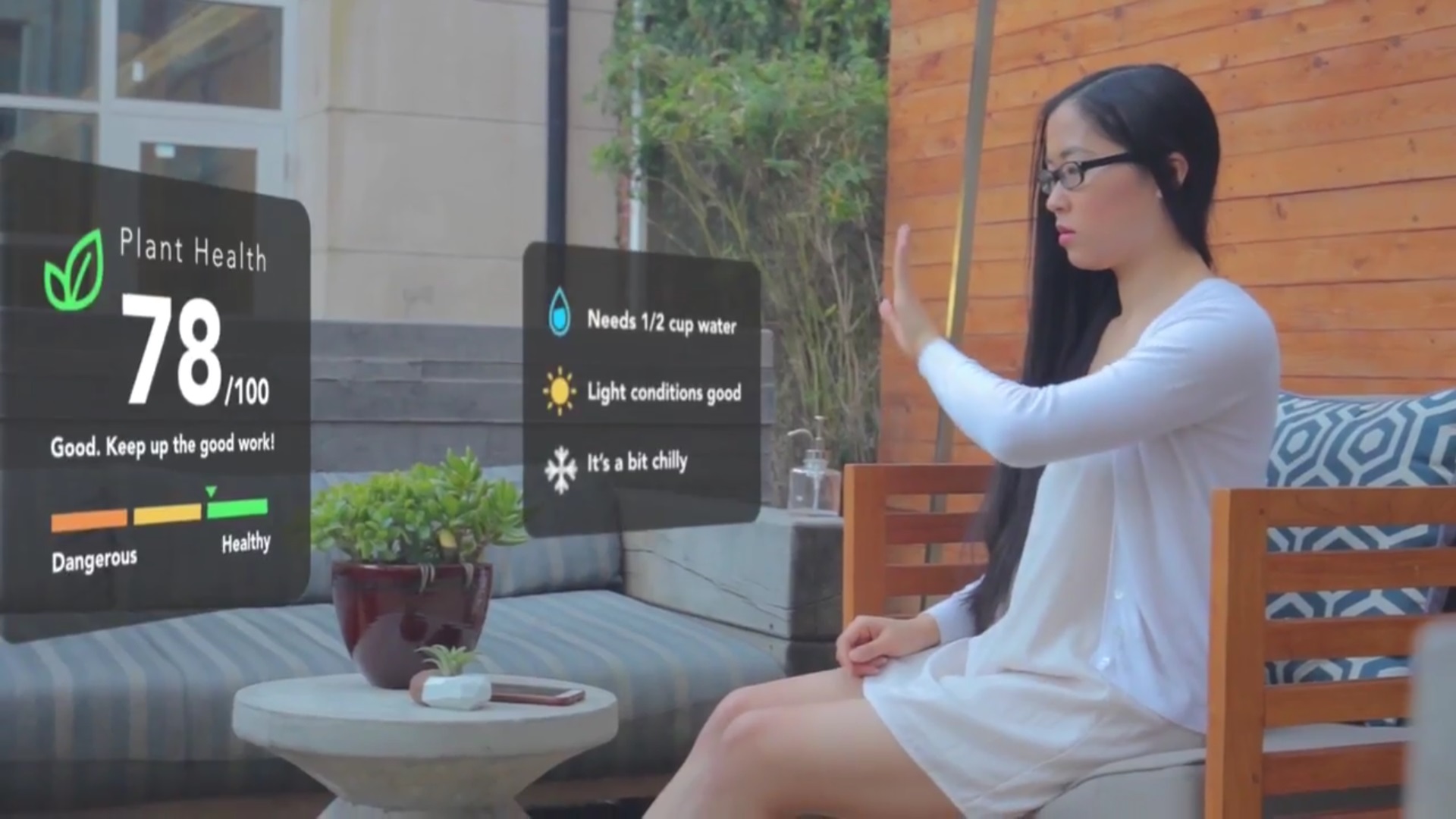

AR Glasses Plant Care App
AR Glasses Plant Care App
AR Glasses Plant Care App
Interface
Augmented Reality
Project Type
Design Concept
Brand
LaForge Optical/ Daqri AR Glasses
Target Users
Home Gardeners
Year
2017
Status
Complete
The Ideation Process
The Ask: Create a novel interface.
We were given the freedom to be as creative and innovative as possible (be out-of-the-box!) so we encouraged each other to come up with anything – regardless of how funny, crazy, or impossible the idea seemed - feasibility was not a constraint.
What We Came Up With: An augmented reality application for glasses that pairs with plant sensors and a mobile app via bluetooth to ease plant care responsibility. It takes out the guesswork involved with assessing plant needs and allows users to feel empowered when making real time care decisions.
How It Can Help: The original idea was rooted in water conservation and efficiency methods but we were excited to expand upon this idea to incorporate other equally important aspects of plant care, such as:
- light
- temperature
- soil pH
- weeds, disease, pests
- and so forth...
Ideally, we wanted our interface to allow people to deepen their emotional relationship with plants and develop a personal connection with nature to improve overall care in a way that is easy, quick, informative, and fun to use.
Here's a step-by-step guide on how to use our plant cARe application:
The Research Process
Go to your users - We sent out a quick survey to determine if people would actually be open to using technology to improve their relationship and care for plants.
Ask some experts - Who we interviewed:
- Agricultural farmer
- Home gardeners
- Landscape designer
Look it up - We looked at several websites that gave how-to guidance, or expert, research-backed advice:
- How To Geek Garden with Arduinos
- Efficient use of water in home gardening
- Farmers interested in augmented reality
- Automatic plant and water sensing
- Data visualization examples
- Display data the un-boring way
Rate the competition - What products out there already exist to meet our user needs?
- Edyn - a currently available plant water sensing device
- Jebiga - digital plant pot that displays an emoji to show plant health
- GreenIQ - a smart, cloud-connected water gardening irrigation system
Meeting User Needs
Based on our survey results, we determined that we would narrow the scope of our project to personal use that could later be scaled to larger applications in full gardens and farming with AR devices like Daqri Helmet. Our team agreed that the problems people encounter the most are:
- assessing plant needs
- understanding how to resolve those needs, and
- maintaining consistent care routines across different periods of time
The implications of our proposed idea are wide-ranging and could help anyone, from a beginner novice to an experienced professional. We could all use a little help raising a mini indoor cactus, maintaining a home rose garden, raising vegetables or herbs in a greenhouse, or even running a full-scale agricultural farm or orchard.
Data Visualization - We were intrigued by the power of data as a way to empower potential users with informative and efficient visualizations that could improve anyone’s ability to monitor plant care across time in the past, present, and future. This inspired us to select augmented reality (AR) as an ideal interface to benefit users by applying this potential in real time. Harnessing the power of data in the moment allows users to prevent poor care from happening, react to care issues if they do arise, and track history and progress. The results are better overall plant health care that saves time and resources. Helping people be more successful with plant care would encourage user adherence and could foster a more widespread appreciation of gardening and nature.
The Design Process
Design Challenges, Constraints, and Considerations
Black Thumbs - Most of our team members are not experienced with the challenges of sustaining plant life for extended periods of time. Understanding the many environmental factors involved to properly assess, care, and track plant health was key to making this project successful. To overcome this, each team member took care of a houseplant for the duration of this project.
Play with AR/VR - Also, only 2 of the 5 team members have personally experienced or interacted with existing AR and VR devices firsthand. My teammate and I have both played with the Microsoft Hololens, HTC Vive, and Daqri Helmet via live demos and video gaming. To overcome this, we took the time to teach the other teammates about our personal experiences with AR devices and how it differs from VR and 2D mobile and web screens.
Let Me See - The design of the interface was more difficult than anticipated because we had to consider whether or not to allow the limitations of current technology constrain our design. Current technology is constrained when displaying information as an overlay over existing real world environments at various distances which can obstruct user field of view (FOV) and be potentially hazardous. Peripheral vision and FOV are limited horizontally and vertically by head and eye rotations. If the user is outdoors in a bright environment, we would want them to ideally be able to maintain high visibility of the user interface screens without experiencing eye strain or muscle fatigue. We also wanted to ensure that the user could appropriately control access to all of the various types of data available to them without feeling overwhelmed with information that clutters their limited FOV.
Lessons Learned
AR Experience - We realized there are huge differences between AR and other technological interfaces like VR and touchscreen devices. Augmented reality is much more immersive and interacts with real physical environments that you cannot touch or feel. Video gaming research was immensely informative for our menu and data display design choices.
Teamwork and Virtual Collaboration - Also, learning how to work collaboratively with team members remotely in various roles was a valuable takeaway. We learned how to improve our communication styles with different individual personalities, encourage participation, foster inclusivity, and execute ideas within short timeframes. We had to learn to prepare and be flexible in case of unplanned deviations. Short sprints helped us make sure we were all being accountable for our deliverables. If any team members needed help, we made sure to reach out and offer support to ensure that our team would reach our goals together. It was important that if anyone was consciously incompetent at any one task, that we would teach and help them learn how to become consciously competent in order for our project to make progress. I count myself lucky to have such a cohesive, talented team dedicated to the success of our project.
Research, research, research - Lastly, we learned that innovating new ideas still requires heavy and extensive research. Instead of allowing existing practices to be a constraint, it allows us to understand what has already been done so we can understand the possibilities of where we can go next.
If you'd like the nitty, gritty details of our entire research and design process, take a look at our Google Slides presentation.
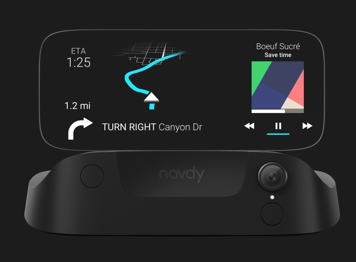
Navdy HUD Paper Prototype
Navdy HUD Paper Prototype
Paper Prototype - Navdy HUD
Interface
Heads Up Display (HUD)
Brand
Navdy
Project Type
Paper Prototype
Target Users
Automotive Drivers
Year
2017
Status
Complete
The Ask
- Choose an interface
- Create a paper prototype of it
- Create a video of yourself using it with at least three (3) screens and at least three (3) interactive elements
The Research Process
Get out of the house/office - I went to the LA Auto Show at the Los Angeles Convention Center to play and demo the actual Navdy product in-person. Actually interacting with the device is a game changing, unique experience that has to be done in vivo - there is little-to-no substitute. There is an innovative see-through display, steering wheel dial and button, and motion detector for waving motions that are best experienced through touch and feel.
Another bonus - I got to ask the sales people questions about the product itself and how it fares for people from a usability perspective. I got insights on what their key selling points were for the device and what their proposed workarounds were for possible issues with the product.
Be the customer - Navdy's website also has a lot of informative feature highlights and how-to videos for potential customers that I studied closely to better understand the task flows, interactions, and movement between screens. I found the flexibility between using wave gestures or the steering wheel dial has distinct differences in user flow between menu choices and selections.
The Design Process
Cut & Paste - I have lots of experience with creating with paper because I love crafts, paper cutting, and origami so thankfully I was already prepared with the proper tools (paper trimmer, precision X-acto knives, glue, tape, and paper of varying qualities).
I already had scraps of paper lying around and played with it until it became a box shape which I decided to use for the base. I found that making the folds and crisp creases for the base came naturally to me based on my previous experiences with origami.
Pop-Up Book - At first, I wasn't quite sure how I wanted to approach the screen design since a paper screen versus the actual see-through display of the Navdy device are entirely different mediums. Inspired by my love of pop-up books, I ultimately decided that using a pull tab to slide through the different screens through a frame would work best to showcase the back and forth movements that happen only horizontally when interacting with the limited wave gestures and dial.
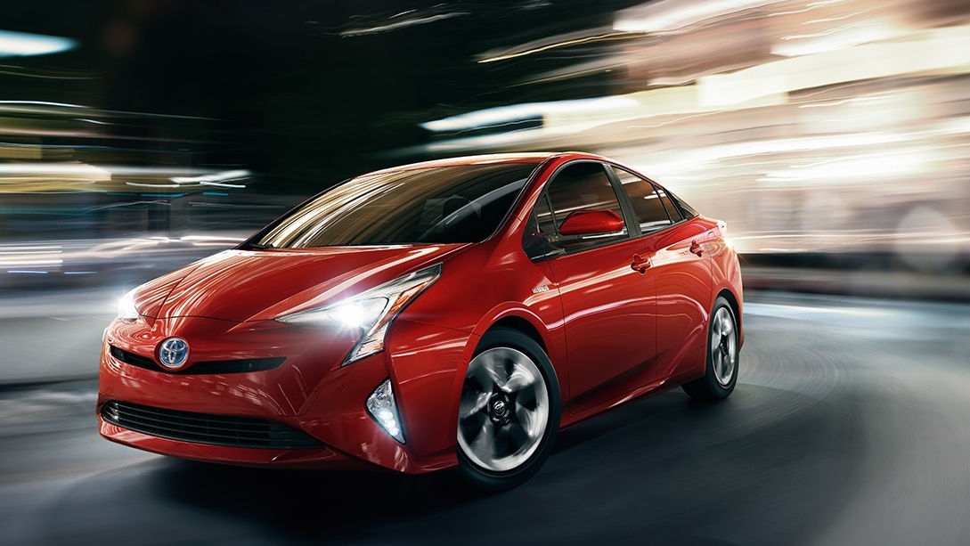
"Where we're going, we don't need roads" - As I was putting the design together, I considered customizing it for a specific audience (my professor Darren Denenberg). But as I was deciding what numbers to display for the speedometer cluster screen (88 mph), I couldn't resist the chance to make it more fun. So I asked myself, what overall theme could fit best and tell a compelling story? It has to have a famous and instantly recognizable:
- Vehicle that could benefit from a futuristic device like the Navdy
- Quotes for the text messaging features, and
- Catchy soundtrack to maximize the music features
And the rest, as they say, is history! Delorean or no Delorean, we all want to navigate somehow when we go Back to the Future!
The Challenges
Showcasing user flow and system status - The most challenging part was examining how the screens flowed between each other based on specific user selections sequentially.
I needed to show not only the screen flow but how the interface was visibly showing the user where they were and what they were selecting.
Filming - Filming the different interactions was difficult since I couldn't find my tripod so I had to film with one hand holding the camera while the other hand struggled to "slide" through the interaction screens on the paper prototype.
Lessons Learned
You never know until you try - I too easily dismissed the benefits and insights I could glean from creating a paper prototype. In this modern day and age, it seemed an outdated medium. It was wrong of me to think that in a typical design process, the default method of creating an electronic prototype on InVision or Axure would win out over making a tangible, physical paper prototype - the whole process was really illuminating for me.
Yes, it's a bit more time consuming but it was worth it!
Insightful - It exposed a lot of steps in the flow process that I missed before and forced me to take a step back to incorporate those early on before real, serious designs could take shape. I found myself really examining my own thought process for each step not only as the designer but as the user as well.
Physicality - Having a paper prototype exist in the real world, off-screen gives a better sense of how users would actually interact with the actual product since it too, lives in the real world (unlike typical mobile apps and websites). Making that match between a 3D draft and the final 3D product solidified the user's actual experience in my the mind much better than any 2D page or screen. Not only did I have to worry about how the user would prefer to see the screen and how it was placed on the body of the HUD itself but physical considerations came into play as well. How well balanced would the device could be, sizing, and understanding where a user would actually place the device inside their cars if their dashboards do not have a flat surface.